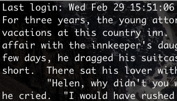
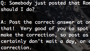
One thing that’s really bugged me since I started using OS X Lion was the way my favorite coding font—Monaco—appears at 14pt and above. On my Snow Leopard installation of OS X the fonts appear bold-ish, but on Lion they appear narrow and emaciated. The characters actually appear so thin that it’s hard to read and the font just does not look good. This forced me into using the font Menlo, which was Apple’s replacement to Monaco as a default terminal font since Snow Leopard (10.6).
Today I found the solution while complaining to a colleague of mine. I honestly do my best problem solving while whining. Originally, I thought the problem was that the font itself had changed. As I was explaining it I figured out that the issue was maybe not the font, but the antialiasing applied to that font. A quick search led me to an article on font smoothing in snow leopard.
Following the guide there all that was left is to execute the command:
defaults -currentHost write -globalDomain AppleFontSmoothing -int 2
and restart my terminal and MacVim.
Here is a before and after:
I think valid values to substitute in for the int are in the range 0–4.
blog comments powered by Disqus
